Farewell, Smoothie
08 Oct 2023Almost two years. That’s how long Smoothie has been FumoNet’s theme. And now it’s time for a change… but not before a little facelift. By that I mean that right now, Smoothie picks the colors it uses from several CSS variables: this is a feature that I never really toyed around with, ever since I pushed last summer’s massive update to this site. But now, I believe that I have finally found a good usecase for it: briefly move to a more refreshing palette, right before Smoothie will be gone for good.
Smoothie’s mistakes
Now, let’s get into why I’m replacing Smoothie in the first place.
Back when I first made it, my goal was imitating old UI design. The way I did it was by using plenty of gradients, giving pretty much every element a well-defined border and decorating the tiniest of elelements with shiny edges and whatnot for extra detail and a more polished feel.
The issue here is that I overdid or misused each of those things. Gradients? I made them way too pronounced and overused them. Borders? Probably redundant, because of the elements’ shiny edges and other effects.
Also, Smoothie does a better job at resembling an old desktop theme, rather than an old website’s. I’ve come to realize this relatively recently, when checking out the plethora of old styles on the CSS Zen Garden: due to past limitations, they are much more minimal compared to my attempt at a throwback style.
But those things are just nitpicks compared to some design decisions I have made that are just absolute nonsense: for instance the oversized homepage, picture thumbnails in art/wallpaper posts expanding vertically and shifting around the whole page’s content, the list goes on.
Sure, I could attempt to pull off another massive makeover for both Smoothie and FumoNet, but at this point I feel like I’m just better off getting rid of a design I’m tired of and starting from a clean slate again. After all, both “components” have issues: Smoothie with clean and time-accurate look, FumoNet with layout and usability.
Fleeting improvements
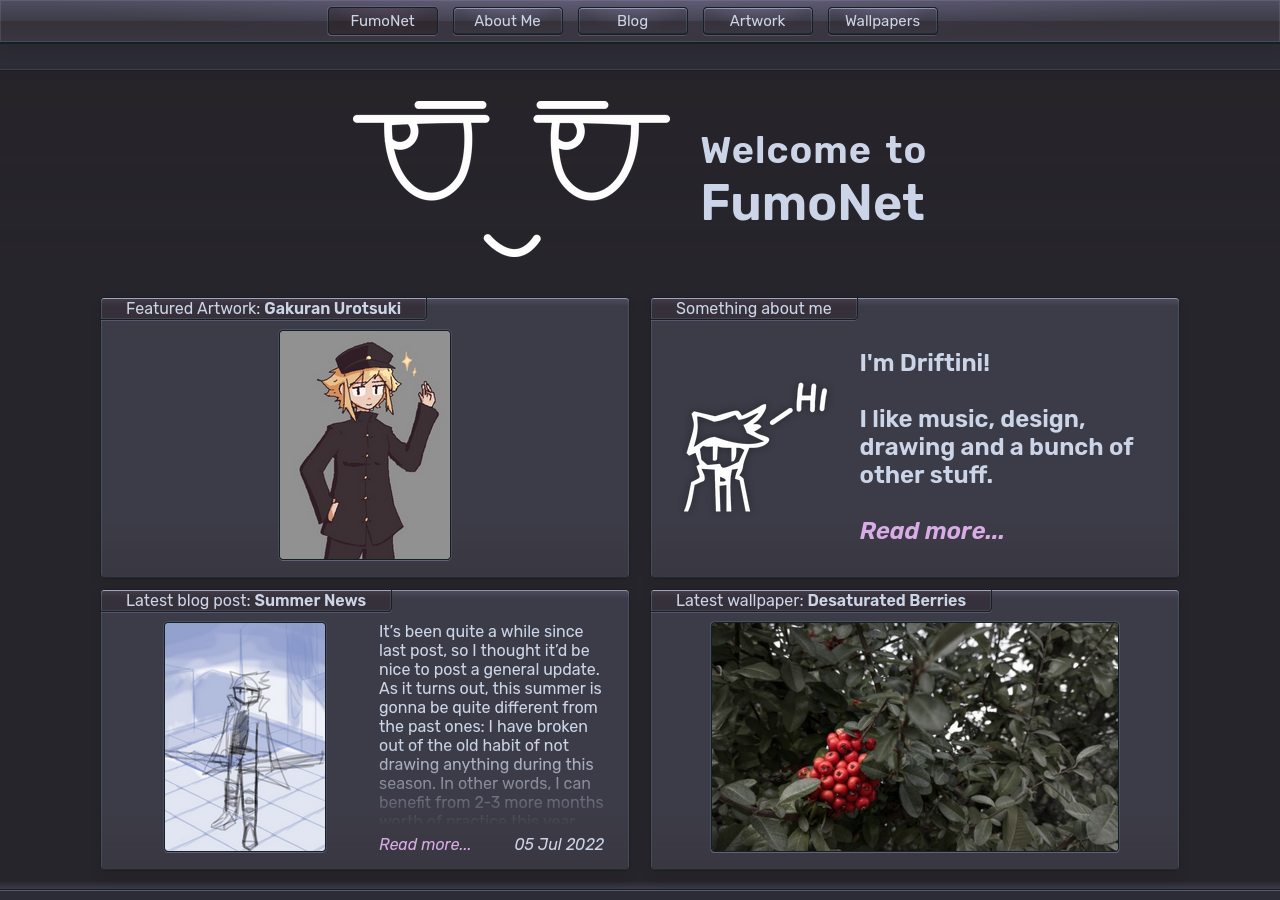
Let’s stop beating the dead horse that is Smoothie, and rather check out the look it’ll spend its last days with (man, that sounds grim).

As you can see, I’ve done away with the boring and soulless-feeling grayscale palette: it has been replaced by mostly bluish-purple tones - “a hint of blueberry” if you will, just to continue my trend of naming themes named after desserts. I’ve also given the “glass” gradients a not-so-subtle radial shine on the top.
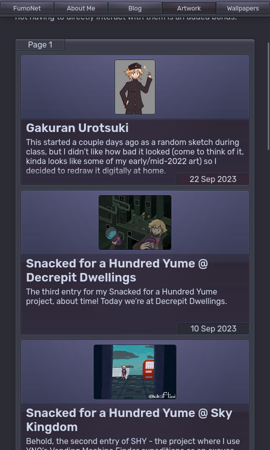
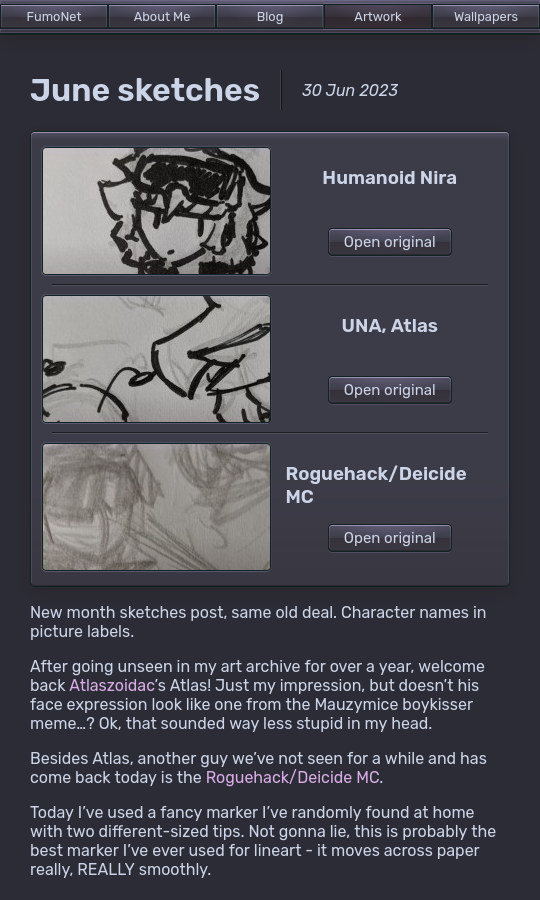
I haven’t stopped at looks alone, though: at last, I’ve added basic mobile support! Now some pages that were previously hellish to interact with on a phone (post indexes in particular) display properly and are much more usable with narrow screens.


Looking to the future
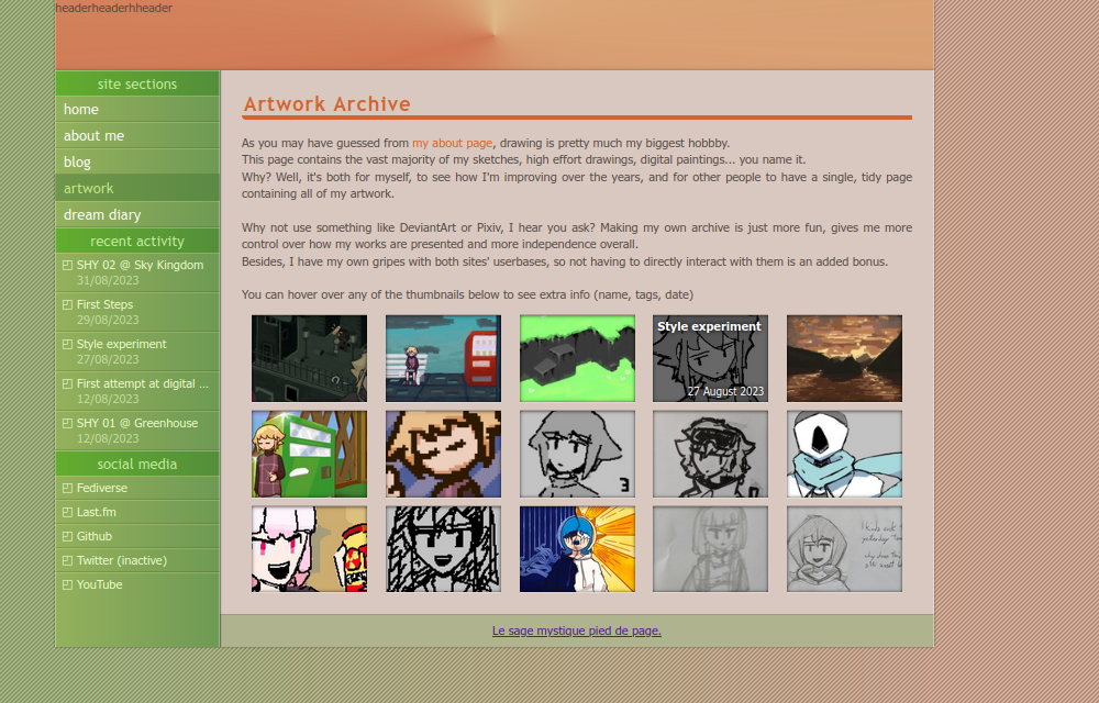
Alright, that sounds cool and all, but what’s in store for FumoNet’s actual future? Here’s a little - and very unfinished - teaser:

For the redesign, I don’t wanna take inspiration from the same timeframe as last time with Smoothie: I decided to turn the clock back even further, to what I believe would be… somewhere between 2005 and 2010?
Unlike with Smoothie, I’m keeping a close eye to reference this time, mostly CSS Zen Garden designs. This last website made me grow to like the idea of a vertical navbar and reduced page width - something I’ve already tried in FumoNet, although very inconsistently and to a lesser extent. I also found the light, yet not plain white themes really refreshing in a web now dominated by pitch dark palettes.
I am also rectifying several design issues present in the current FumoNet, such as “detail pages” for art/wallpaper posts containing a low-quality thumbnail of their picture(s) instead of the full-res one, hiding it behind a needless button press.
As for mobile support, I think it should be pretty straightforward except for the new sidebar. I’d obviously have to get rid of the “recent activity” section, then maybe collapse other buttons to icons? I’ll need some time to come up with a proper solution.
Last but not least, I am planning changes to picture posts’ internal structure. Picture variants are a feature I implemented back in 2021 and were intended for linking multiple resolutions of wallpapers in… well, wallpaper posts. The issue is that all picture posts need to use variants, since links to original pictures are stored inside the variants, together with labels.
Since they’ve become nothing more than a pointless leftover at this point, I’m finally getting rid of them. Wallpaper posts will be edited to drop their lower-res variant in favor of the highest-res one, since there was really no point in separating the two to begin with. Or at least, that will happen if wallpaper posts will still be a thing by the time the redesign comes out.
The wallpaper collection is another thing I’ve barely ever used throughout the website’s lifespan, and I believe it’s about time to get rid of it. My only hunch is that I don’t know where to move pre-existing wallpaper posts. I could probably take them to the artwork archive, although I don’t think they belong there that much, at least not as separate posts.
In conclusion…
…brace yourselves for a long wait before any more updates on the redesign. It took me long enough to get barebones mobile support implemented in FumoNet’s current version, let alone a total change of look of the site.