The big FumoNet update
13 Jun 2022About two months of work, finally coming to a close. Meet the new FumoNet.
As it turns out, this website’s old stylesheets were a massive pain to work with and expand. So, I restarted from scratch with a new approach: a main stylesheet containing a ton of variables and SCSS mixins for UI components, and a separate stylesheet specifically made for FumoNet.
I decided to do things this way to make porting the theme elsewhere a much easier job, and also to make future updates easily applicable to every port without having to hunt for dozens of different classes, each with their own tweaks.
Enough about the internals, though. What does all this translate to on my website? Well, a pretty massive visual makeover.
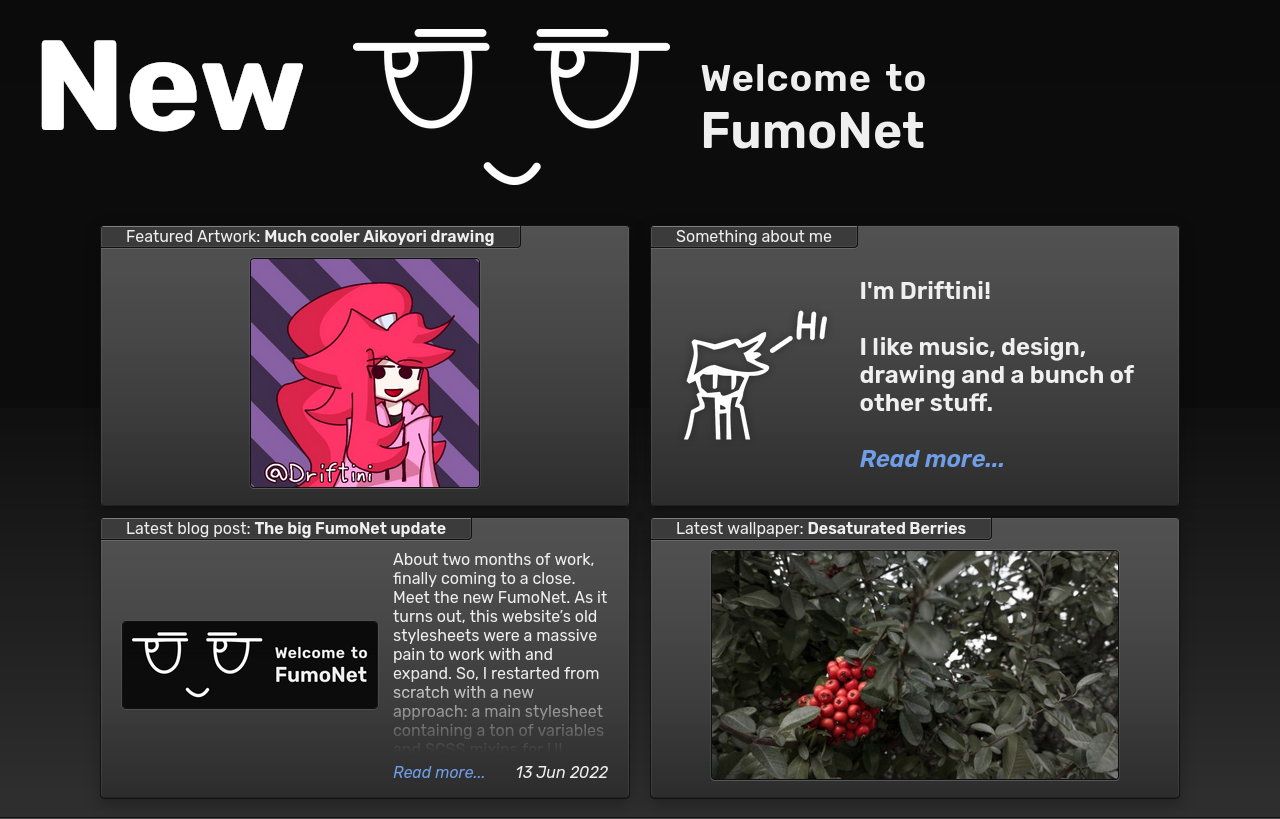
The homepage’s layout is still pretty similar to the old one, although properly animated now and showing a manually selected art post, instead of the latest one like before.
What did change quite a bit is the Blog, Wallpapers and Artwork index pages: instead of a bunch of floating massive cards, now everything is contained in a compact box with the thumbnail (if any), some of the post’s body and the date.
The pagination pill has also been replaced by a row of buttons below the posts.


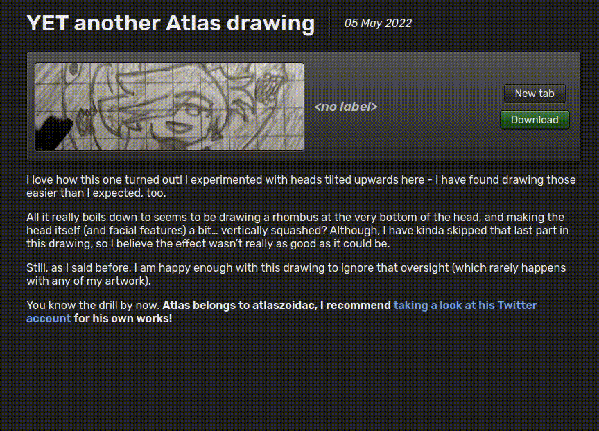
Though, I believe one of the biggest improvements in this update lies in the post details page for the Artwork and Wallpaper archives.
Now attachments don’t waste an stupidly enormous amount of screen space anymore, making posts with tons of pictures look way cleaner.
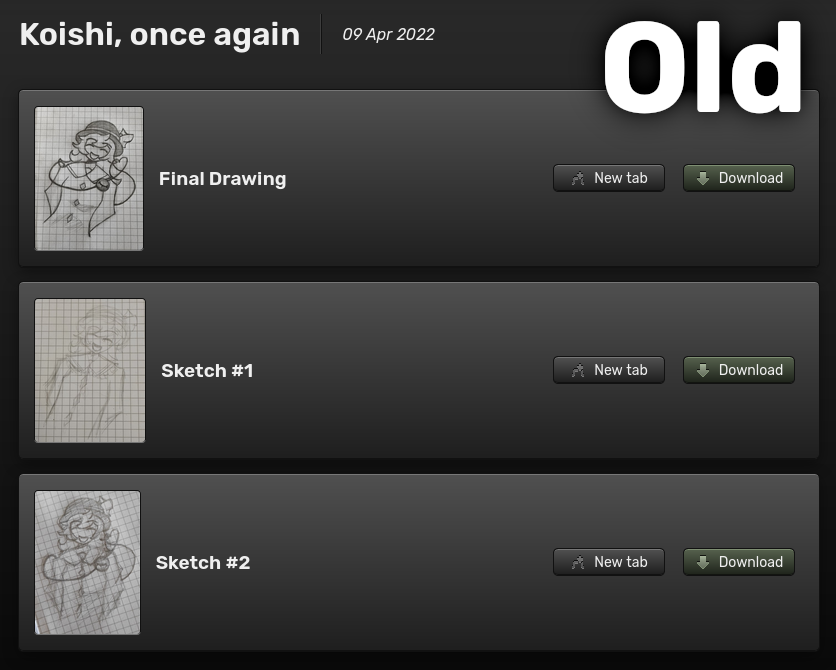

Oh, and attachments can be hovered on to expand them. In other words, the index pages now focus on showing as much content as possible in a clean-ish way, while the details pages finally focus on the actual pictures.
I believe there are still many rough edges in this update (the elephant in the room being the lack of a mobile stylesheet for now), but I will clean them up as time goes on… hopefully.